What’s your favorite way to present your data findings and analysis VISUALLY??
Visualization is one of the most important areas of Data Science. “A picture is worth a thousand words.” “Seeing is believing, right?!”…….In my sales career, my most successful business presentations have included a visual representation of the proposal. My career moved forward when I learned to include visual presentations.
Visualization is also extremely important in the “Exploratory Data Phase” of any project. Using a simple histogram, or scatterplot will give you a clear picture and understanding of your data. I found that this was especially true when I had a multi-dimensional, large data set with 100s of columns/rows or when the relationship between input/output was unclear. Matplotlib and Seaborn packages make visualization extremely easy to do.
This Blog is to summarize visualization techniques in a basic sense. At the start of this project, I was familiar with only a few techniques. So, as I became more proficient in each techique, I was and am better able represent the data. Better representations will lead to better business recommendations and therefore better decisions. And in the hiearchy of learning, explaining a topic (teaching it) is the best way to learn.
Here’s a great chart for selecting the right visualization technique based on your data analysis. I researched this topic extensively in multiple sources, but I bookmarked this webpage: 5 quick and easy data visualizations in python and found myself referring back to it.
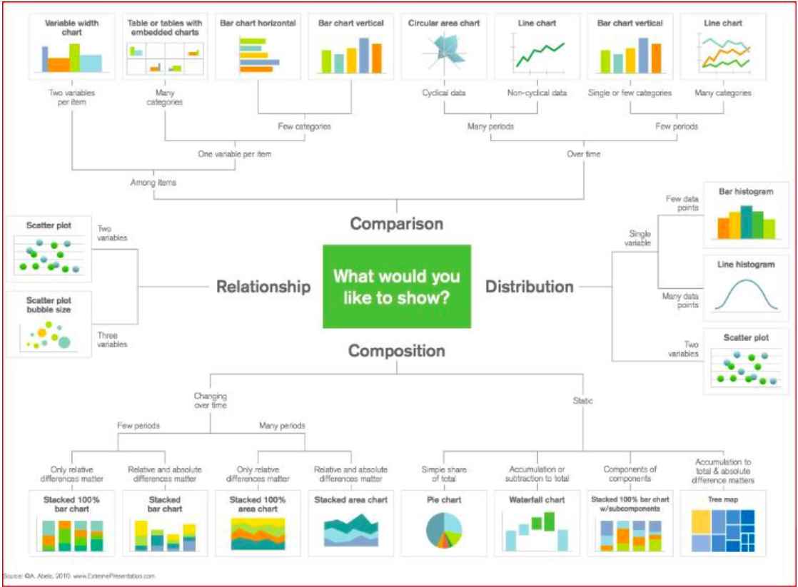
Visualization Techiques can be separated into areas…….to wrap my head around this extremely importand topic, I have separated the techniques into FOUR categories.
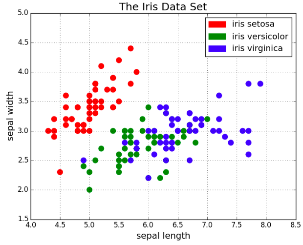
‘RELATIONSHIP VISUALIZATION’ techniques can be represented by Scatter Plots. They visually describe the relationship between two variables in a ‘basic’ form. A Bubble Size Scatter Plot is a variation of a Scatter Plot with an added dimension. The data points are replaced with bubbles and the additional dimension is represented by the size of the bubbles. Just like a Scatter Plot, a Bubble Plot uses horizontal and vertical axes that are value axes. In addition to the x values and y values that are plotted in a scatter chart, a Bubble Plot z (size) values.
‘DISTRIBUTION VISUALIZATION’ techniques can be broken down into 1 variable (ex: Histogram) or 2 variable (example: Scatter Plot) plots. Then the 1 variable plots can be further segmented into the number of data points.
A few data points with one variable would be represented on a Bar Histogram and many on a Line Histogram. Then Scatter Plots could be used when the data has two variables.
HOW IS A SCATTER PLOT A DISTRIBUTION ?
Box Plot is also a visualization tool to represent distribution. It is used to represent median, mean, and quartiles. The bottom and top of the solid-lined box are always the first (25%) and third (75%) quartiles of the data. And the horizontal line inside the box is the median (second quartile). The dashed lines, ‘whiskers’, that extend from the box show the overall range of the data. Outliers can be identified using the Box Plot. Outliers are outside the ‘whisker’ lines.
‘COMPARISON VISUALIZATION’: 2 types of comparison techniques are separated by whether they are “among factors” or “over time”. Examples of Comparison techniques are: LIne Chart and Bar Chart.
When to use Line Chart in comparing data: Line charts are used to track changes over short and long periods of time.. Also, line charts can also be used to compare changes over the same period of time for more than one group. They are best used when you can clearly see that one variable varies greatly with another and have a high correlation. Line charts fall into the “over-time” category.
Bar charts are used to compare things between different groups (“among factors”). They can be used to track changes ‘over time’, but only when the changes are larger.
Bar charts are used to compare things between different groups (“among factors”). They can be used to track changes ‘over time’, but only when the changes are larger.
‘COMPOSITION VISUALIZATION’ techniques represent the ‘composition of the data being analyzed. Data can be either ‘static’ or ‘changing over time’. To represent the data, you can use Stacked Bar Charts, Area Stacked Bar Charts, Pie Charts, Waterfall Charts, or Tree Maps.
Here are some other visualizations that I used in a recent project along with their code and why they were useful:
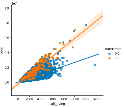
Scatter Plots Scatter plots are great for showing the relationship between two variables since you can directly see the raw distribution of the data. You can also view this relationship for different groups of data simply by color coding the groups as seen in the first figure below. This visualizes the relationship between three variables. The color of the dots represents a 3rd dimension (ex: “Waterfront” ).
 Now for the code. First import Matplotlib’s pyplot with the alias “plt”. To create a new plot figure plt.subplots() is called. x-axis and y-axis data is called to the function and then passed to ax.scatter() to plot the scatter plot. The point size, point color, and alpha transparency can also be set. You can even set the y-axis to have a logarithmic scale. The title and axis labels are then set specifically for the figure.
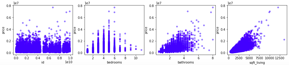
import matplotlib.pyplot as plt fig, axes = plt.subplots(nrows=1, ncols=4, figsize=(16,3)) for xcol, ax in zip([ ‘id’, ‘bedrooms’,’bathrooms’,’sqft_living’], axes): kc_house.plot(kind=’scatter’, x=xcol, y=’price’, ax=ax, alpha=0.4, color=’b’)
Here’s the a simple code for the above scatter plot. You can get a nice visualization with 2 lines of code:
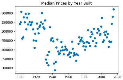
plt.scatter(yr_built_grpmedian.index,yr_built_grpmedian.price) plt.title(“Median Prices by Year Built”)
The scatter plot represents the Median Home Value by it’s Year Built in King County, WA. In my project, I was analyzing how the selling price of a home changed based it’s year built (‘yr_built’). I grouped the homes by year and calculated their median. As you can see from the plot, ~1960 homes reached a median low. Years before and years after this time frame were higher. I going to go out on a limb and make a WAG that homes >60 years old that were below the median value are torn down and replaced by newer homes. This would tend to raise the overall median value for older homes as lower value, older homes are replaced with newer homes.
QQ Plots
QQ Plots were extremely valuable in strengthening my project’s final model. QQ Plots visualize whether the model residuals are normally distributed. In my project, non-normal residuals were caused by outliers. My visualizations below show before outliers were removed and after. Notice the points in the ‘before’ plot form a curve instead of a straight line. These Q-Q plots indicate that the data is skewed. I removed outliers and ran the QQ plot again.
fig = sm.graphics.qqplot(model.resid)
plt.title(val)
	  plt.show()
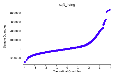
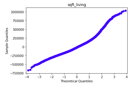
Although, these outliers did not have an impact on the model’s Rsquared, they showed that the data was highly skewed and this was visualized in the QQ Plots. To improve the QQ PLOT of residuals, I removed the outliers. Removing the outliers for price, sqft_living, and grade normalized the distribution of their residuals. (I then had to note that my model would only apply to homes that were within the boundaries of my data.) This is shown in the second QQ Plot where the line is straight and therefore an example of normal distribution. Removing the outliers strengthened my model and this was demonstrated when my Mean Squared Errors were significantly reduced. That’s a good thing!!
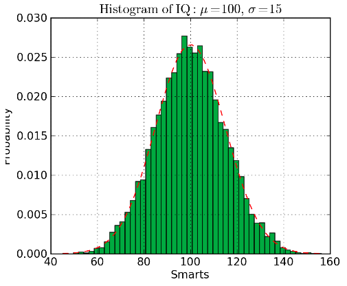
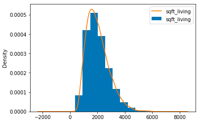
Histograms Histograms are useful for viewing (or really discovering) the distribution of data points. Check out the histogram below where frequency vs Square Feet of Living Space histogram is plotted. It’s clearly seen that the concentration towards the center and what the median is. Using the bars (rather than scatter points, really gives us a clear visualization of the relative difference. The use of bins shows the “bigger picture”.
The code for the histogram in Matplotlib is shown below.
kc_house3.hist(figsize=(18,10), bins=10 );
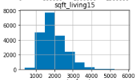
There are two parameters to take note of. Firstly, the ‘bins’ parameters controls how many discrete bins we want for our histogram. More bins will give us finer information but may also introduce noise and take us away from the bigger picture. On the other hand, less bins gives us a bigger picture of what’s going on. Secondly, the cumulative parameter is a boolean which allows us to select whether our histogram is cumulative or not. This is basically selecting either the Probability Density Function (PDF) or the Cumulative Density Function (CDF).
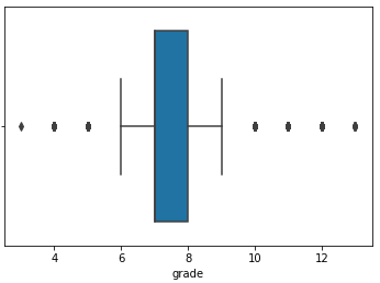
Box Plots
In my Kings County Project, as mentioned, there were outliers. In the EDA phase, I used the boxplot to visualize them. Outliers are to the right (and left) of the ‘whisker’ line(s). After viewing the boxplot, I checked the variance of data by viewing the number of points > than an ‘arbitrary’ value picked off of the boxplot. Initially, I did not drop outliers. But after completing an initial model, I decided to circle back and analyze. In the final analysis, removing outliers improved the predictability of the model.
After seeing the outliers, I mathematically set a threshold for the outliers. I decided to identify outliers using a threshold of IQR=3. I considered removing outliers for ‘bathrooms’,’bedrooms’,’sqft_living’ and’grade using IQR=3. Thresholds for each predictor is listed below. Although, these outliers did not have an impact on the model’s Rsquared, they showed that the data was highly skewed and this was visualized in the QQ Plots. To improve the QQ PLOT of residuals, this model removed outliers of predictors that are used in the final model. In doing so, I had to note that the model is only “meant to predict Sale price for houses with less than 5 bathrooms, 8 bedrooms, and less than 5900 sq ft.”
Box plots also give us important statistics visually. The bottom and top of the solid-lined box are always the first and third quartiles (i.e 25% and 75% of the data), and the band inside the box is always the second quartile (the median). The whiskers (i.e the dashed lines with the bars on the end) extend from the box to show the range of the data.
Here’s the code: import seaborn as sns sns.boxplot(x=kc_house[‘grade’])
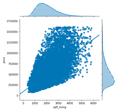
SEABORN JOINT PLOT
Here we’ll use a joint plot, which will allow us to visually inspect linearity as well as normality assumptions as a single step through the use catter plots, distributions, kde and simple regression line.
for column in [‘yr_built’,’sqft_lot15’,’sqft_living15’,’sqft_above’,’sqft_lot’,’sqft_living’]: sns.jointplot(x=column, y=’price’, data=kc_house3, kind=’reg’)
SCATTER MATRIX
MULTICOLLINEARITY ANALYSIS
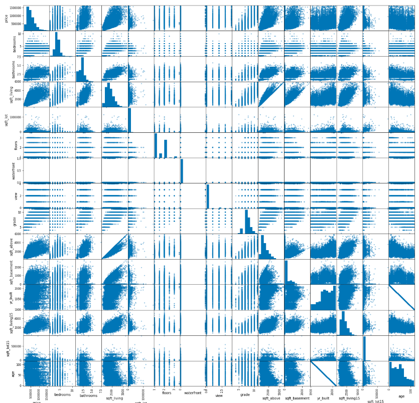
pd.plotting.scatter_matrix(kc_house4, figsize=[21,21]);
Conclusion There are your some of the data visualizations using Matplotlib and Seaborn.